
Apple
Consumer hardware and software
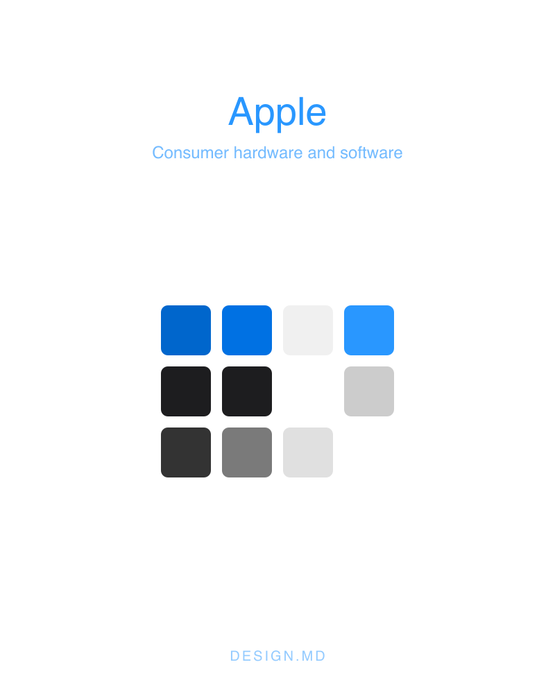
Apple's marketing and product-page language: generous whitespace, large confident type, and a near-total absence of chrome.
apple.comColor palette
Accent
Primary#0066cc
Primary brand color — key actions and emphasis.
Primary Focus#0071e3
Accent color used within the product's own UI.
Divider Soft#f0f0f0
Borders and dividers.
Neutral
Primary On Dark#2997ff
Text and icon color on a solid primary fill.
Ink#1d1d1f
Primary text color.
Body#1d1d1f
Secondary or muted text.
Body On Dark#ffffff
Text and icon color on a solid primary fill.
Body Muted#cccccc
Secondary or muted text.
Ink Muted 80#333333
Primary text color.
Ink Muted 48#7a7a7a
Primary text color.
Hairline#e0e0e0
Borders and dividers.
Canvas#ffffff
Page background.
Canvas Parchment#f5f5f7
Page background.
Surface Pearl#fafafc
Card and panel surfaces.
Surface Tile 1#272729
Card and panel surfaces.
Surface Tile 2#2a2a2c
Card and panel surfaces.
Surface Tile 3#252527
Card and panel surfaces.
Surface Black#000000
Card and panel surfaces.
Surface Chip Translucent#d2d2d7
Card and panel surfaces.
On Primary#ffffff
Text and icon color on a solid primary fill.
On Dark#ffffff
Text and icon color on a solid primary fill.
Type scale
- Hero Display
- 56px · 600 · 1.07
- Display Lg
- 40px · 600 · 1.1
- Display Md
- 34px · 600 · 1.47
- Lead
- 28px · 400 · 1.14
- Lead Airy
- 24px · 300 · 1.5
- Tagline
- 21px · 600 · 1.19
- Button Large
- 18px · 300 · 1
- Body Strong
- 17px · 600 · 1.24
- Body
- 17px · 400 · 1.47
- Dense Link
- 17px · 400 · 2.41
- Caption
- 14px · 400 · 1.43
- Caption Strong
- 14px · 600 · 1.29
- Button Utility
- 14px · 400 · 1.29
- Fine Print
- 12px · 400 · 1
- Nav Link
- 12px · 400 · 1
- Micro Legal
- 10px · 400 · 1.3
Fonts
PrimarySF Pro TextWeights 300, 400, 600Fallback: system-ui, -apple-system, sans-serif
SecondarySF Pro DisplayWeights 400, 600Fallback: system-ui, -apple-system, sans-serif
Spacing & shape
- Xxs
- 4px
- Xs
- 8px
- Sm
- 12px
- Md
- 17px
- Lg
- 24px
- Xl
- 32px
- Xxl
- 48px
- Section
- 80px
- None
- 0px
- Xs
- 5px
- Sm
- 8px
- Md
- 11px
- Lg
- 18px
- Pill
- 9999px
Guidelines
- Reserve Primary for primary actions and emphasis — it is the system's one accent color.
- Keep type on the documented family set (SF Pro Text, SF Pro Display).
- Use one of the documented corner radii (0px, 5px, 8px, 11px, 18px, 9999px) rather than a one-off value.
- Build spacing from the documented scale (4px, 8px, 12px, 17px, 24px, 32px, 48px, 80px) instead of arbitrary padding.
- Don't apply Primary as a full-page background or a large fill.
- Don't introduce a second accent color alongside Primary.
- Don't mix in an additional typeface beyond the ones documented here.