
Slack
Team messaging
Team messaging and collaboration software, styled with a friendly, approachable palette across a long-running brand system.
slack.comColor palette
Accent
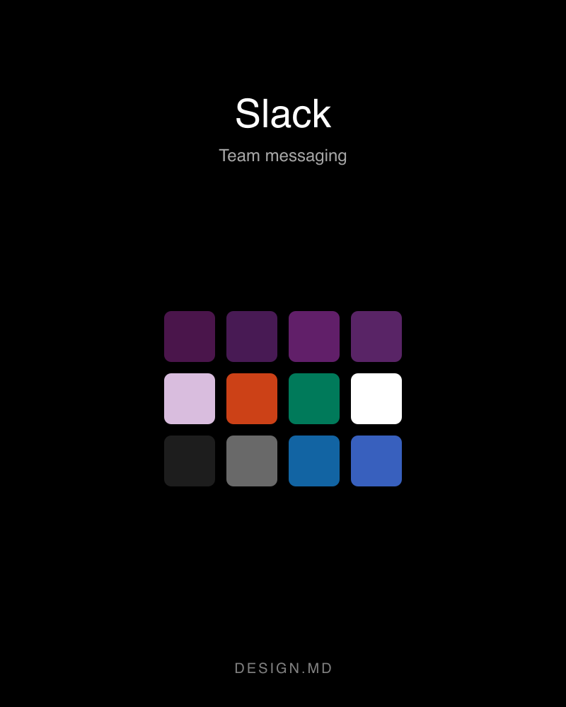
Primary#4a154b
Primary brand color — key actions and emphasis.
Primary Deep#481a54
Accent color used within the product's own UI.
Primary Press#611f69
Pressed or hover state of its base color.
Primary Tint#592466
Accent color used within the product's own UI.
On Aubergine Mute#d9bdde
Accent color used within the product's own UI.
Semantic
Semantic Error#cc4117
Error and destructive state.
Semantic Success#007a5a
Success state.
Neutral
On Primary#ffffff
Text and icon color on a solid primary fill.
Ink#1d1d1d
Primary text color.
Ink Mute#696969
Primary text color.
Link Blue#1264a3
Primary text color.
Link Hover#3860be
Pressed or hover state of its base color.
Canvas#ffffff
Page background.
Canvas Cream#f4ede4
Page background.
Canvas Lavender#f9f0ff
Page background.
Surface Elev#ffffff
Card and panel surfaces.
Surface Aubergine#4a154b
Card and panel surfaces.
Hairline#e6e6e6
Borders and dividers.
Hairline Strong#000000
Borders and dividers.
Type scale
- Display Xxl
- 64px · 700 · 1.12
- Display Xl
- 58px · 600 · 1.25
- Display Lg
- 50px · 700 · 1.12
- Display Md
- 32px · 700 · 1.25
- Heading Lg
- 24px · 700 · 1.33
- Heading Md
- 22px · 600 · 1.4
- Heading Sm
- 18px · 600 · 1.56
- Body Lg
- 18px · 400 · 1.55
- Button Lg
- 18px · 700 · 1
- Body Md
- 16px · 400 · 1.55
- Body Strong
- 16px · 700 · 1.5
- Button Md
- 16px · 700 · 1.38
- Button Cap
- 14.4px · 700 · 1
- Caption
- 14px · 400 · 1.43
- Micro Cap
- 12px · 700 · 1
Fonts
PrimarySalesforce-SansWeights 400, 700Fallback: system-ui, -apple-system, sans-serif
SecondarySalesforce-Avant-GardeWeights 600, 700Fallback: system-ui, -apple-system, BlinkMacSystemFont, sans-serif
Spacing & shape
- Xs
- 4px
- Sm
- 8px
- Md
- 12px
- Lg
- 16px
- Xl
- 20px
- Xxl
- 24px
- Huge
- 28px
- Xs
- 2px
- Sm
- 4px
- Md
- 8px
- Lg
- 12px
- Xl
- 16px
- Xxl
- 48px
- Pill
- 90px
Guidelines
- Reserve Primary for primary actions and emphasis — it is the system's one accent color.
- Keep type on the documented family set (Salesforce-Sans, Salesforce-Avant-Garde).
- Use one of the documented corner radii (2px, 4px, 8px, 12px, 16px, 48px, 90px) rather than a one-off value.
- Build spacing from the documented scale (4px, 8px, 12px, 16px, 20px, 24px, 28px) instead of arbitrary padding.
- Don't apply Primary as a full-page background or a large fill.
- Don't introduce a second accent color alongside Primary.
- Don't mix in an additional typeface beyond the ones documented here.