
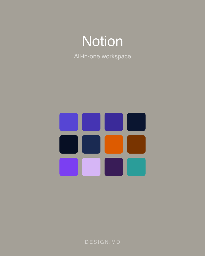
Notion
All-in-one workspace
An all-in-one notes, docs, and project workspace known for warm, editorial minimalism and serif headings.
notion.soColor palette
Accent
Primary brand color — key actions and emphasis.
Pressed or hover state of its base color.
Accent color used within the product's own UI.
Accent color used within the product's own UI.
Accent color used within the product's own UI.
Accent color used within the product's own UI.
Accent color used within the product's own UI.
Accent color used within the product's own UI.
Accent color used within the product's own UI.
Accent color used within the product's own UI.
Accent color used within the product's own UI.
Accent color used within the product's own UI.
Accent color used within the product's own UI.
Accent color used within the product's own UI.
Accent color used within the product's own UI.
Card and panel surfaces.
Card and panel surfaces.
Card and panel surfaces.
Card and panel surfaces.
Card and panel surfaces.
Card and panel surfaces.
Card and panel surfaces.
Card and panel surfaces.
Accent color used within the product's own UI.
Accent color used within the product's own UI.
Accent color used within the product's own UI.
Accent color used within the product's own UI.
Semantic
Success state.
Warning state.
Error and destructive state.
Neutral
Text and icon color on a solid primary fill.
Primary text color.
Pressed or hover state of its base color.
Primary text color.
Primary text color.
Card and panel surfaces.
Page background.
Card and panel surfaces.
Card and panel surfaces.
Borders and dividers.
Borders and dividers.
Borders and dividers.
Primary text color.
Primary text color.
Secondary or muted text.
Text and icon color on a solid primary fill.
Text and icon color on a solid primary fill.
Type scale
- Hero Display
- 80px · 600 · 1.05
- Display Lg
- 56px · 600 · 1.1
- Heading 1
- 48px · 600 · 1.15
- Heading 2
- 36px · 600 · 1.2
- Heading 3
- 28px · 600 · 1.25
- Heading 4
- 22px · 600 · 1.3
- Heading 5
- 18px · 600 · 1.4
- Subtitle
- 18px · 400 · 1.5
- Body Md
- 16px · 400 · 1.55
- Body Md Medium
- 16px · 500 · 1.55
- Body Sm
- 14px · 400 · 1.5
- Body Sm Medium
- 14px · 500 · 1.5
- Button Md
- 14px · 500 · 1.3
- Caption
- 13px · 400 · 1.4
- Caption Bold
- 13px · 600 · 1.4
- Micro
- 12px · 500 · 1.4
- Micro Uppercase
- 11px · 600 · 1.4
Fonts
Spacing & shape
- Xxs
- 4px
- Xs
- 8px
- Sm
- 12px
- Md
- 16px
- Lg
- 20px
- Xl
- 24px
- Xxl
- 32px
- Xxxl
- 40px
- Section Sm
- 48px
- Section
- 64px
- Section Lg
- 96px
- Hero
- 120px
- Xs
- 4px
- Sm
- 6px
- Md
- 8px
- Lg
- 12px
- Xl
- 16px
- Xxl
- 20px
- Xxxl
- 24px
- Full
- 9999px
Guidelines
- Reserve Primary for primary actions and emphasis — it is the system's one accent color.
- Keep type on the documented family set (Notion Sans).
- Use one of the documented corner radii (4px, 6px, 8px, 12px, 16px, 20px, 24px, 9999px) rather than a one-off value.
- Build spacing from the documented scale (4px, 8px, 12px, 16px, 20px, 24px, 32px, 40px, 48px, 64px, 96px, 120px) instead of arbitrary padding.
- Don't apply Primary as a full-page background or a large fill.
- Don't introduce a second accent color alongside Primary.
- Don't mix in an additional typeface beyond the ones documented here.